In design point of view it is the space between columns, words, letters, images and margins is called as Breathing space.
Example 1
 |
| Breathing Space is Bad in Lines |
 | ||
Breathing Space is Good in Lines, Words and Margins
|

White spaces
White is a back ground color of the page(text, images and margins) is called as white spaces.
Examples 1

Examples 1
1. The main reason is that dark text(black) on light backgrounds(white) is better for readability compare to the light text(white) on dark background(black).
2. In the below fig left side text better readability compare to the right side text.
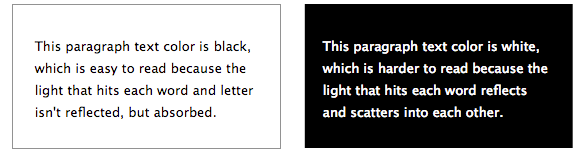
White Background Black Text and Black Background White Text
Examples 2
1. White background gives the Better readability of text.
2. White spaces are called as negative spaces.
3. Negative space gives the eyes place to rest, which in turn helps the reader to consider and other element in page. It also defines the boundaries of positive space.
4. It help separate paragraphs of text, images and other portions of a document, and helps a document look less crowded.
4. It help separate paragraphs of text, images and other portions of a document, and helps a document look less crowded.
 |
| White Space Used as Background |
 |
| White Space Used as Background in E Commerce Site |
| White Space Used as Background |
 |
| White Background News Paper |
 |
| White Background Text Book |


Breathing Space
 Reviewed by Unknown
on
September 25, 2017
Rating:
Reviewed by Unknown
on
September 25, 2017
Rating:
Reviewed by Unknown
on
September 25, 2017
Rating: